Armida Residences
The brand design for Armida’s property development draws inspiration from the enchanting character of Armida, the sorceress, to create a captivating and distinctive identity.
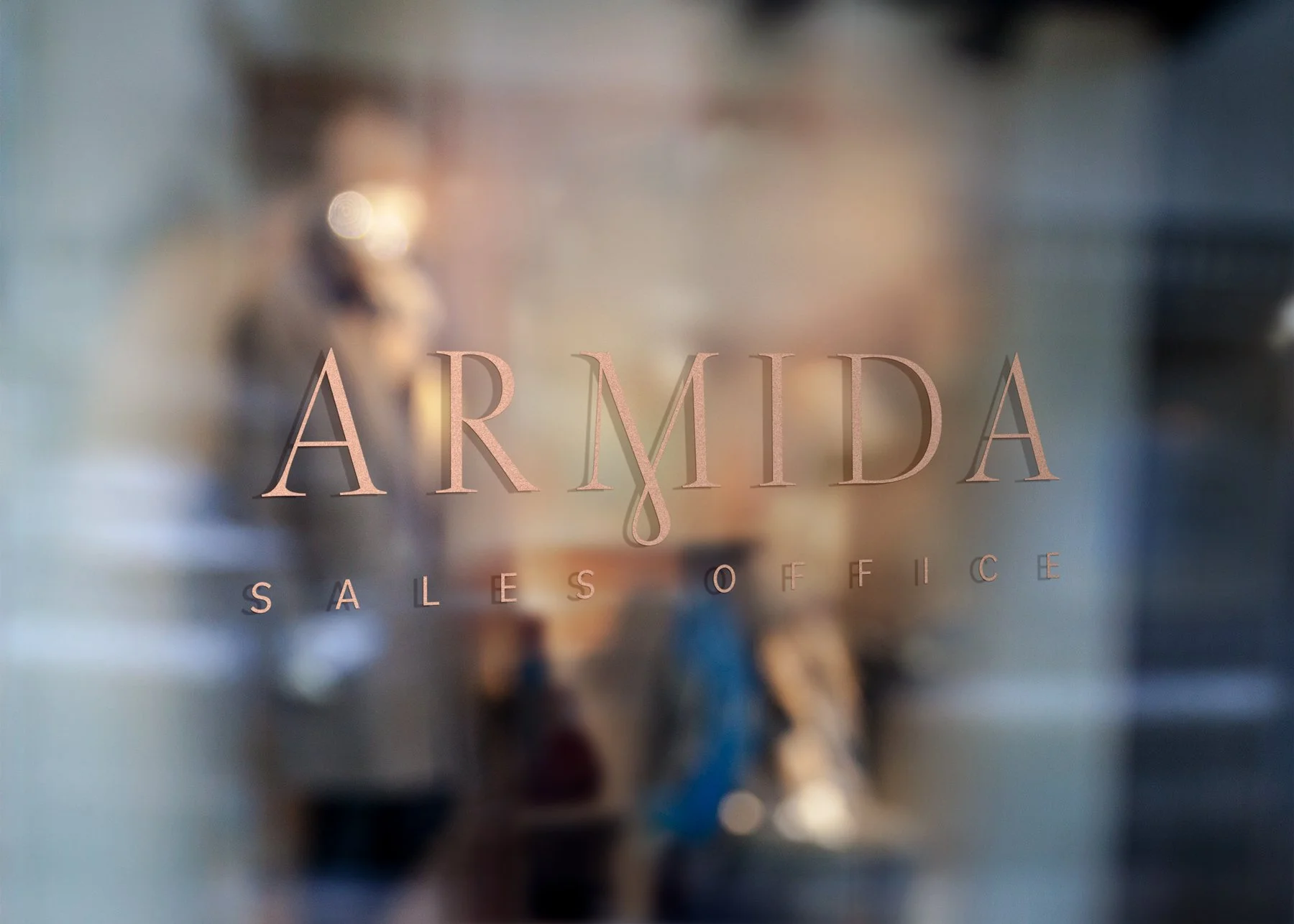
The focal point of the logo is the delicate drop in the letter ‘M,’ which not only adds a touch of elegance but also serves as a visual metaphor for the magic and allure associated with the brand. The choice of a feminine jewel shape further enhances the sense of sophistication and luxury, while the bold capital typeface adds strength and stability to the overall design.
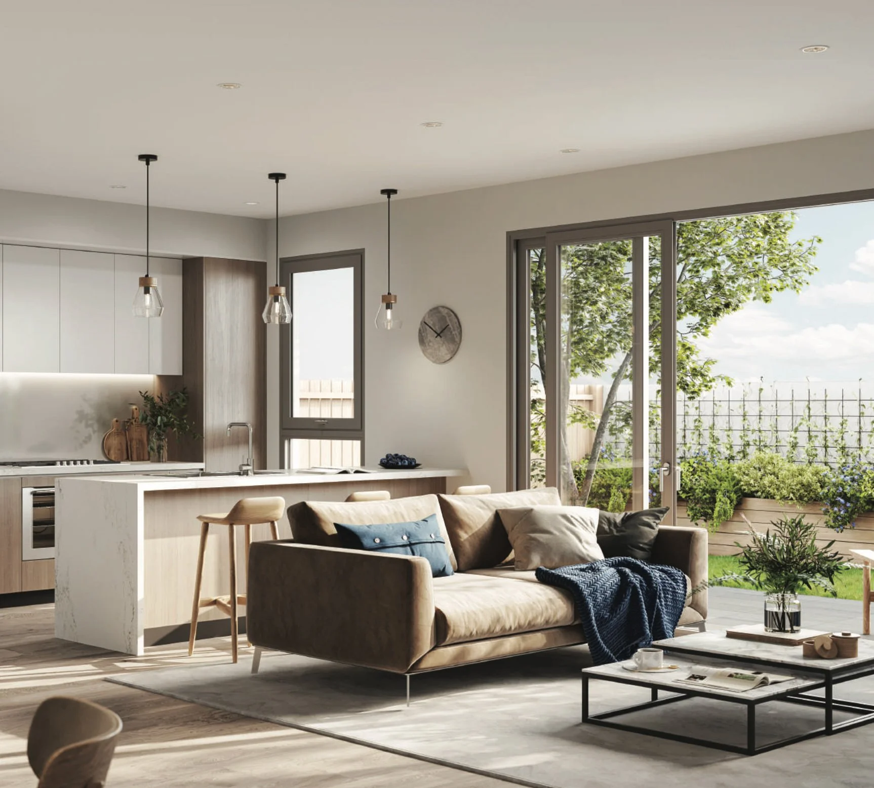
The carefully curated pink, fleshy-toned palette aligns with a feminine aesthetic and conveys warmth and a sense of comfort, creating an inviting and memorable visual identity that reflects the unique essence of Armida’s property development.


