South Burnett Physiotherapy
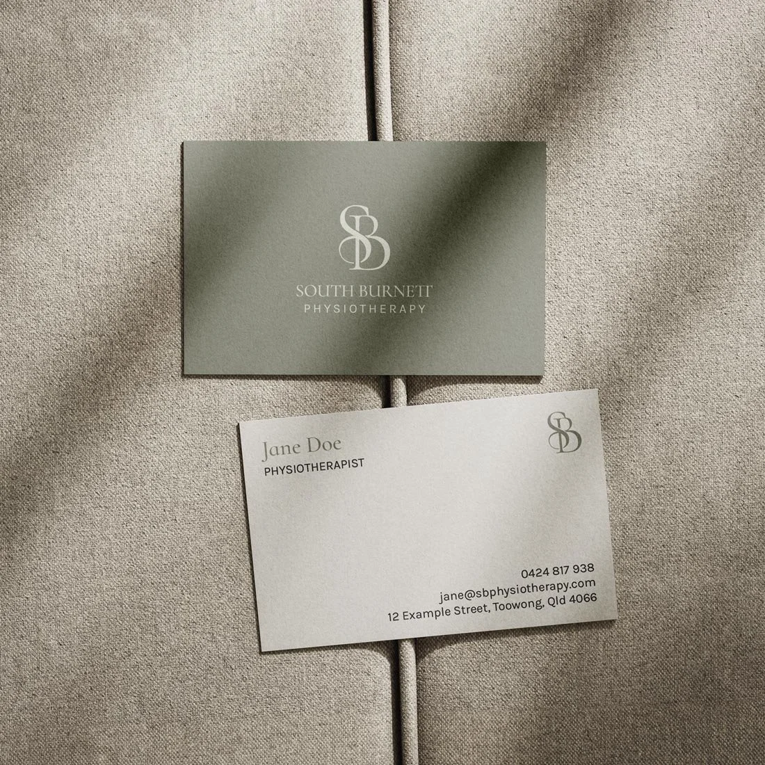
Recently, with new ownership, South Burnett Physiotherapy undertook a complete redesign to represent their fresh and modern direction.
Moving away from conventional physiotherapy logo styles, which often feature vibrant colors and anatomical imagery, the focus shifted to creating a minimalistic brand identity. The new logo conveys warmth through a monochromatic palette inspired by earthy tones, reflecting a grounded approach. The sleek and understated wordmark embodies a lifestyle-centric ethos while maintaining a professional demeanor, essential for building trust and respect.