Merlot Noir: Why Burgundy is an Icon
Every season, one shade steps out of the background and into the spotlight commanding attention without shouting. Right now, it’s burgundy. Or, as we’re calling it, Merlot Noir.
This deep, velvety shade is everywhere, from fashion runways and lipstick tubes to interiors and branding palettes. Burgundy has always been more than just a colour. It’s timeless, elegant, and unapologetically bold. Burgundy doesn’t ask for approval; it owns the room the moment it’s introduced.
A Brief Love Affair with Burgundy in Design
Burgundy has a long and rich history, both literally and figuratively. Here are a few fascinating moments that show why this shade has never truly gone out of style:
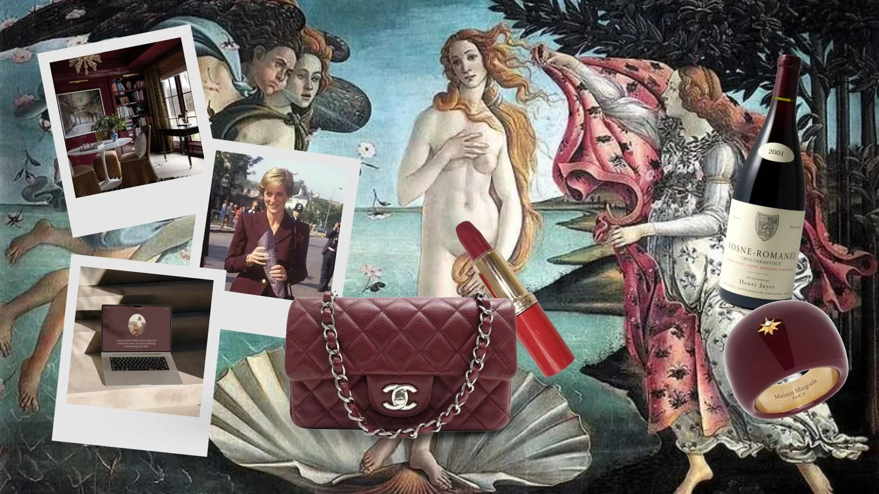
The Renaissance Statement: In Renaissance art, deep reds like burgundy symbolized wealth, power, and prestige. The pigments were rare and expensive, worn only by royalty and nobility. Using burgundy was a display of status.
Victorian Opulence: In the Victorian era, burgundy was everywhere in interiors; think velvet curtains, upholstered furniture, and wallpaper. It became synonymous with sophistication and dramatic flair.
The ‘80s Power Move: Burgundy made a comeback in the 1980s, a decade of strong design statements. Designers used it in fashion, logos, and interiors as a colour of authority; confident yet sultry.
Modern Minimalism’s Secret Weapon: Today, burgundy is being reimagined as part of minimalist palettes. Paired with beige, taupe, or muted pastels, this once-dramatic shade becomes sleek, contemporary, and endlessly chic.
Why Burgundy is Having Its Moment
Part of the reason burgundy feels so magnetic right now is that it bridges opposites. It’s romantic but edgy. Luxurious yet grounded. Burgundy can feel vintage or futuristic, depending on the context. This duality makes it endlessly versatile for designers and creators.
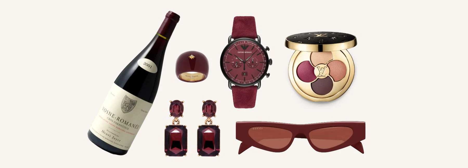
On Instagram, moodboards are filled with burgundy velvet textures, wine-stained lips, silk slip dresses, vintage armchairs, and branding accents that give a whisper of drama without overpowering a composition. Burgundy carries its own story; and invites interaction.
How to Use Burgundy in Branding and Design
Fashion & Apparel: Swap black for burgundy for an instant upgrade; same chic effect, but warmer and more unexpected.
Branding & Graphic Design: Use burgundy as a highlight in logos, social templates, or packaging. It signals sophistication without being overused.
Home & Interiors: Layer burgundy accents (pillows, rugs, statement chairs) against neutrals to add depth and mood.
Final Sip
Like a glass of Merlot at golden hour, burgundy is classic, indulgent, and just a little mysterious. It isn’t here to fade into the background. Burgundy is the It-factor shade of design; timeless, bold, and unforgettable.