What Makes a Good Logo in 2025?

Let’s be honest; logos are having a bit of a moment. Again.
Every second brand refresh is either going super minimal or throwing it back to early-2000s maximalism. But while trends come and go (looking at you, stretched serif fonts), the fundamentals of a good logo haven’t changed all that much.
What has changed? How people use them and what we expect from them.
So, if you’re building a brand or planning a refresh this year, here’s what makes a logo not just pretty, but powerful in 2025.
1. It’s not just a logo, it's a system
Gone are the days of one hero logo slapped on everything from your email footer to your signage.
In 2025, a good logo is part of a flexible brand suite. That means:
A stacked version
A horizontal version
A submark (think: Instagram profile pic or favicon)
And maybe a wordmark or initials version if your brand needs it
The goal? Your brand looks good no matter where it shows up—from business cards to billboard to iPhone 15 Pro Max.
2. It works everywhere (and at every size)
A good logo still has to tick the classics:
✔️ Legible at a tiny size
✔️ Looks clean in black & white
✔️ Doesn’t fall apart on signage
✔️ Feels good on merch (yes, including that branded tote bag)
We’re designing for a world where your logo might live on social, on print, inside a Canva template, or even embossed into packaging. It has to be versatile.
If it only looks good in one very specific mockup, it’s not it.
3. It aligns with your actual brand personality
No hate to cool-looking logos but if your soft, values-led wellness brand is rocking an angular, tech-y icon because “it looks clean,” we need to talk.
In 2025, authenticity over aesthetic.
A good logo should feel like an extension of your brand’s voice, values, and vibe. It doesn’t have to say everything but it should feel like the right fit. If you’re not sure what your brand personality is, this freebie can help you.
This might mean:
Soft edges for a nurturing or holistic brand
Bold shapes and contrast for a confident disruptor
Playful hand-drawn touches for something more personal
It’s less about what’s trendy and more about what’s true.
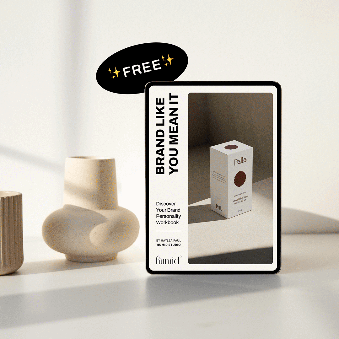
Discover Your
Brand Personality ✨
Ready to create a brand that actually feels like you?
Download my free workbook to uncover your brand personality with easy prompts and a quiz to help you show up with clarity and confidence.
4. It’s memorable, not overdesigned
The best logos don’t scream; they whisper just the right message at just the right time.
Think of the Nike swoosh. The Airbnb "A." Even Chanel’s interlocking Cs. These marks aren’t complicated. They’re consistent, recognisable, and used with intention.
Good logos are simple but not boring. There’s usually a subtle cleverness or unexpected detail that makes people look twice. That pause? That “ooooh I get it” moment? That’s gold.
5. It’s built to evolve with you
Your logo isn’t your whole brand but it is the entry point.
A good logo in 2025 isn’t static, it grows with you. Whether you’re launching new products, entering new markets, or reimagining your visual identity in a few years, your logo should be able to come along for the ride.
This is why we always design with future use in mind. (No one wants to be backed into a visual corner six months after launch.)
Final Thoughts
The perfect logo doesn’t just look good. It functions. It flexes. It feels like you.
At Humid Studio, we design logos that live inside cohesive, strategic, and thoughtful brand systems built to show up beautifully everywhere your brand does.
If you’re not sure your current logo’s pulling its weight, let’s talk and see what solution could be right for you and your business.